Old Inbox (Left) and New Inbox (Right)
We’re excited to share our latest Android release with you, Burner 3.6.2. We’ve made a lot of improvements to streamline the most commonly used parts of the Burner app.
This update makes the Inbox cleaner, offering you a view of all your messages at a glance. Messaging is much more fun and legible. And the new Settings screen makes it easier to customize your Burner with fewer taps.
Upgraded Inbox
The new Inbox view features:
More visibility into Burner expirations with banners that let you know when a line is low on minutes, texts or about to expire
A condensed message view so you can see more of your incoming texts and calls at a glance
- The ability to change your Burner color by dragging down on the Inbox (we call them "pull down" actions). You can also mark all messages as read or delete them all here too.
Streamlined Messaging
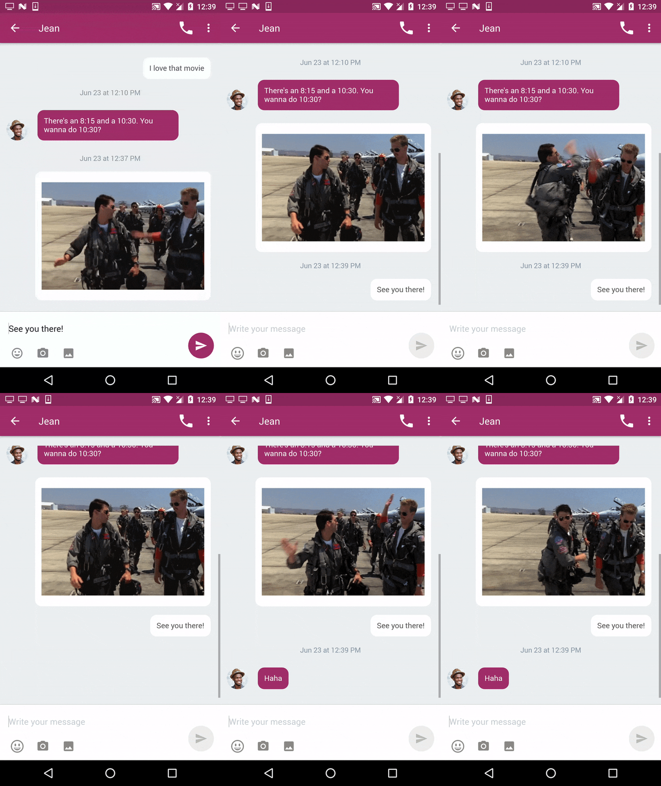
We’ve punched up the contrast of the message bubbles for easier reading. Your contact photos are also included so you can tell who’s talking.
Redesigned Settings
The Settings screen has been redesigned to make it more clear how you can set up your lines. We’ve also renamed some of the options you see here:
Core Settings
- Important functionality including rings, notifications, voicemail greeting, and caller ID
Connections
- Try a new Connection and get more out of your Burners. Archive messages and voicemails to Google, respond to texts on Slack or crowdsource voicemails for your podcast.
Advanced Settings
- Richer control over how you receive calls (with in-app calling and forwarding)
Thanks to everyone who has beta tested, answered our questions, and submitted feedback about your experience with Burner. We hope these improvements make Burner more useful.
Let us know what you think about the updates by leaving a review on the Google Play Store or by texting feedback to (310) 919-5060.


