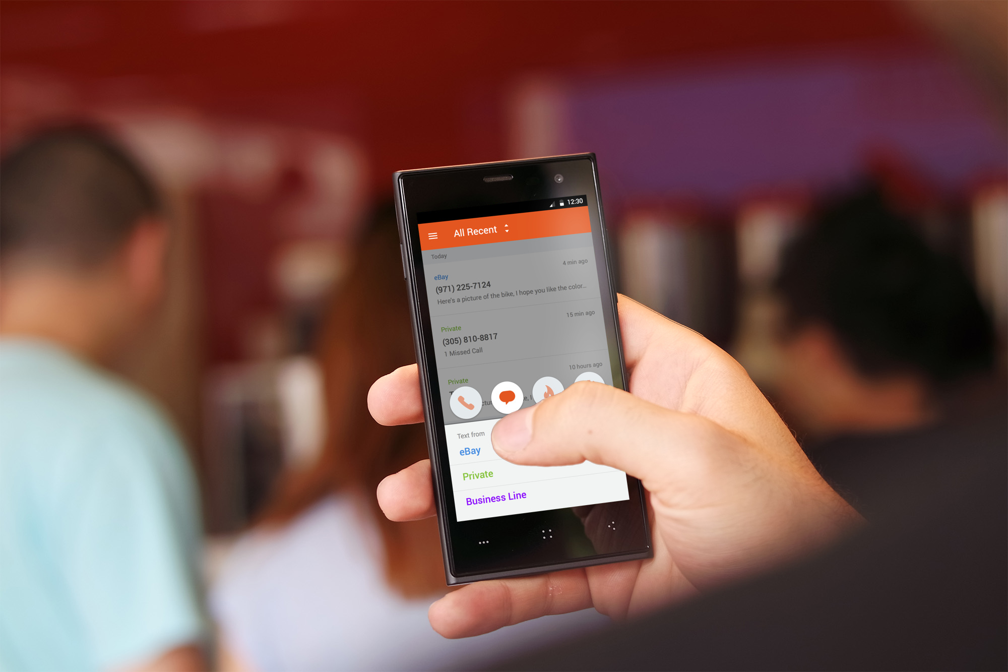
We’re excited to announce that we’re launching a brand new look and feel for Burner on Android! This is our biggest design update for Android and builds upon a ton of feedback that we’ve heard from customers. The goal is always to make Burner the easiest way to stay in touch with people without compromising your personal information or phone number, and we think Burner 3.0 does just that. Here are some of the highlights:
Unified Inbox
Managing more than one number in Burner just got much easier! With the unified inbox you can view and respond to all of your recent conversations from different Burner numbers in one place. To help you stay organized, we now give each of your Burners a unique color, so when you’re viewing conversations quickly in the inbox, you know exactly which Burner someone is contacting you through. If you ever need to go through your older messages, or you only want to view the messages on one of your Burners you can easily filter by that Burner and view your entire history.
Material Design
Again, this is our biggest design update for Burner. You’ll see the use of colors, animations and transitions throughout the app, fully embracing material design principles. Navigation and design patterns should feel familiar and blend right into your workflow with all the apps you love!
Android Wear
We know that our customers are busy, managing work and personal lives and anything we can do to make Burner more accessible when you’re on the go is huge win! Burner now supports use with your smartwatch so you can quickly view your notifications and messages and respond in an instant with voice commands.
Stay tuned
This is just the beginning of a ton of new features that will be coming to Android so stay tuned and connect with us on Facebook and Twitter to get all the latest news!


